WORK
Here is some of my work!
Happy satisfied clients is what makes me happy. I love taking a client’s idea and making it a reality! Contact me now for a free consultation, or use our website estimate calculator to get an idea of how much to budget for your vision.
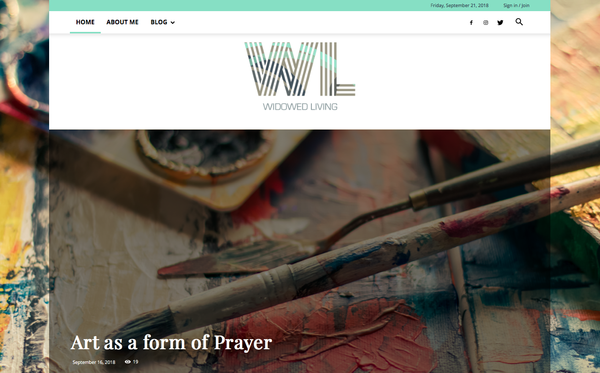
Widowed Living Blog
This is where the text for the front of your card should go. It's best to keep it short and sweet.
Visit the Widowed Living Blog
Website Design Services
This is where the text for the back of your card should go.
LEARN MORE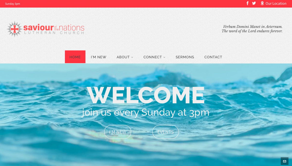
Saviour of the Nations Lutheran Church
This is where the text for the front of your card should go. It's best to keep it short and sweet.
Visit the SOTN Lutheran Church Website
Website Design Services
This is where the text for the back of your card should go.
LEARN MORE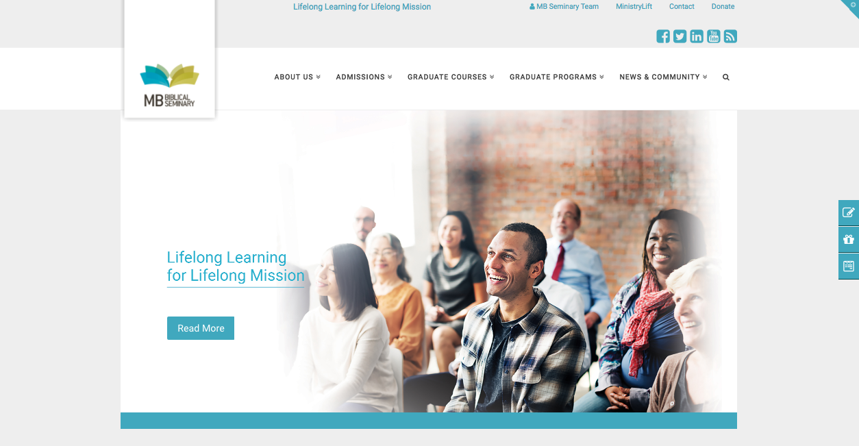
MB Seminary Website
This is where the text for the front of your card should go. It's best to keep it short and sweet.
Visit MB Seminary Website
Website Design Services
This is where the text for the back of your card should go.
LEARN MORE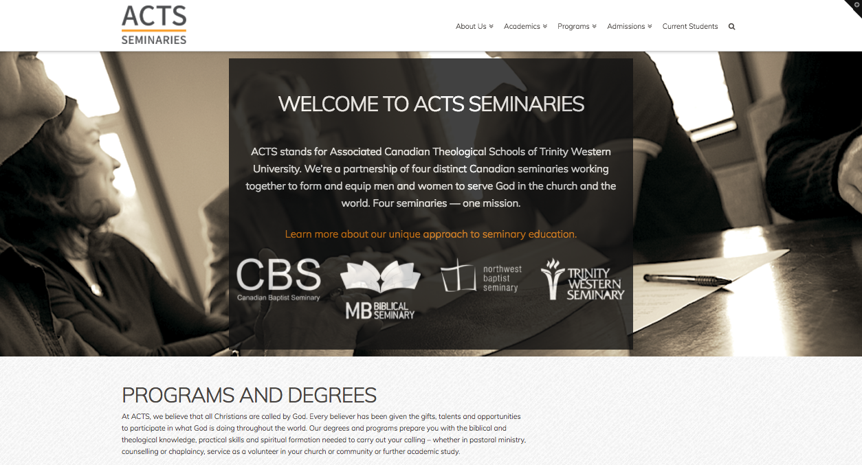
ACTS Seminaries Website
This is where the text for the front of your card should go. It's best to keep it short and sweet.

Newsletter
This is where the text for the front of your card should go. It's best to keep it short and sweet.

Poster
This is where the text for the front of your card should go. It's best to keep it short and sweet.
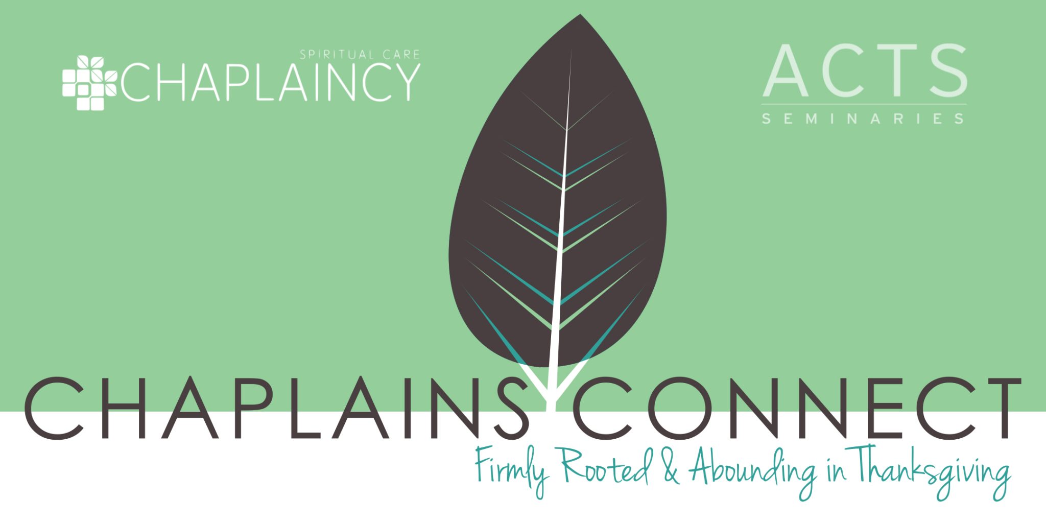
Poster
This is where the text for the front of your card should go. It's best to keep it short and sweet.
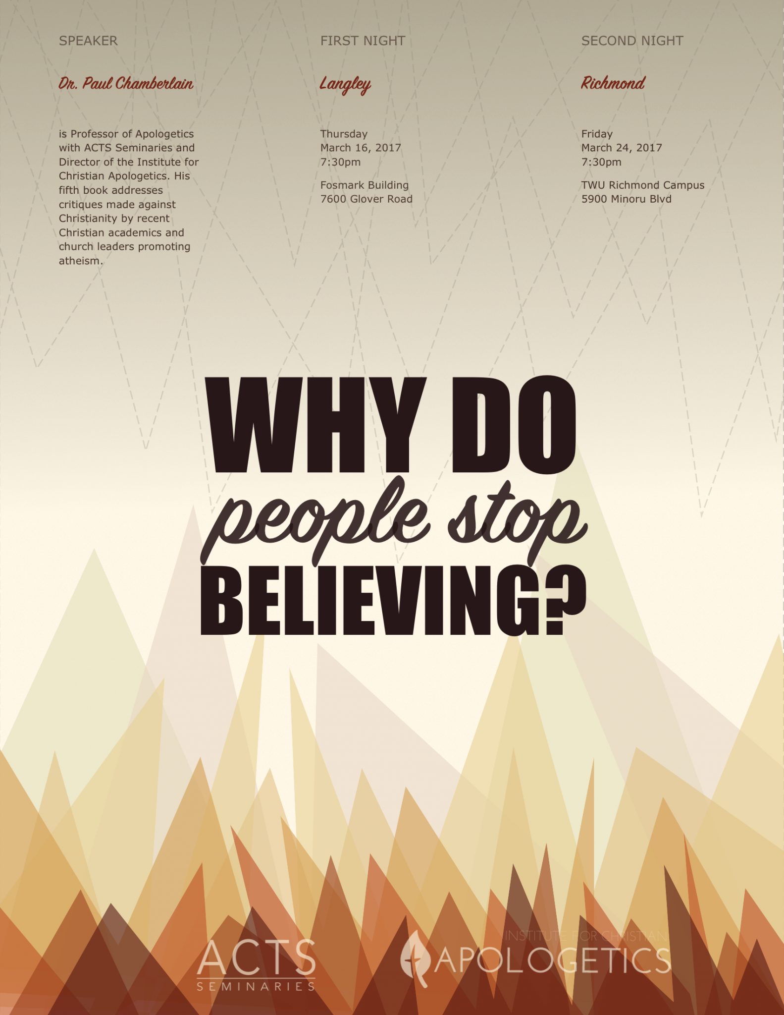
Poster
This is where the text for the front of your card should go. It's best to keep it short and sweet.

Poster
This is where the text for the front of your card should go. It's best to keep it short and sweet.

Brochure
This is where the text for the front of your card should go. It's best to keep it short and sweet.

Product Catalogue
This is where the text for the front of your card should go. It's best to keep it short and sweet.

Flyer
This is where the text for the front of your card should go. It's best to keep it short and sweet.
Testimonials
What Our Clients Are Saying About Us
Jeff Peters
MB Seminary, Langley
“Kyle (Parsons Design) designed a great looking website for the seminary that is clean, uncluttered and very functional for the needs of our students and constituency. His attention to detail and ability to customize along the way were skills we were looking for. Kyle was helpful from when we first imagined the project and all the way through to completion.”
Liisa Polkki
ACTS, Langley
“Kyle is an inspiration to work with. His design of our website helped us to rise in the SEO to the top in a very short time! In addition to website design and website management, he has experience in marketing, strategic planning and re-branding. If you’re looking for a fresh, current look for your website, I highly recommend him.”
David Sigrist
SOTN, Vancouver
“Kyle (Parsons Design) partnered with us from the very beginning to find a solution that meets our needs. He is always quick to help when we need it and he has provided us a site that is really easy for anyone on our staff to edit.”
SHARE US WITH YOUR FRIENDS
